Metrics and Evaluating Models
In this section, we describe mathematically, and provide some intuition around, common metrics used for evaluating machine learning models. Note that some of these metrics only make sense for some types of learning tasks (e.g., IOU makes sense for object detection but not for classification).
It is also important to note that no singular metric is "best" for quantifying model performance and that each metric provides its own nuanced view of production tradeoffs (e.g., optimal thresholding).
Loss (Error)
Loss is a measurement of the distance from the model's output to the desired output.
To understand loss, we first have to examine what the model actually provides as an output.
Consider a model whose purpose is to distinguish cats from dogs.
For any input, the model will output a vector that scores each of the categories the
model is trained to recognize, e.g., for some input the output might be:
cat: 0.9, dog: 0.1. Depending on the model, the outputs may look like probabilities
(as above), or they may just be raw numbers (positive or negative).
When we compute common metrics such as accuracy, we usually just say that
the model's prediction is whichever output had the largest score (in this case "cat"),
and that output is either right or wrong.
When the human-provided annotation for the above input is "cat", then the model interprets
the right answer (or what the model should produce) as cat: 1.0, dog: 0.0.
When we measure loss, we choose a distance function and measure the distance between our
output of cat: 0.9, dog: 0.1 and the correct cat: 1.0, dog: 0.0; the idea
being that smaller distances to the right answer are better.
There are two fundamental reasons we use loss when training a neural network.
First, the loss function is differentiable (has a slope), which is critical for computing gradients (or directions of steepest descent) for our model updates while training.
Each small update we make is designed to make incremental improvements to the model's loss.
Second, using loss as a metric allows us to improve an output that is already correct.
For example, if the model outputs cat: 0.75, dog: 0.25 when the answer
should be cat: 1, dog: 0, then there is still room for improvement (i.e., increasing
the model's confidence in its output of cat).
Note: There are many different loss functions (e.g., mean-squared error, cross entropy, negative log likelihood, etc.), but each is simply a method for measuring a distance to the right answer. Keep in mind that since different loss functions are different ways to compute distance, they are not comparable to each other. But, every loss function will be 0 if the outputs are exactly correct and positive otherwise.
Confusion Matrices
Confusion matrices are a way of exploring model predictions in greater detail than a single number can provide; they also serve as a convenient mechanism for understanding many of the other useful metrics we'll describe. Each cell in a confusion matrix is a count of model outputs. The row of the confusion matrix represents the desired model output (the truth), and the column represents the model's prediction. The number in row i column j is the number of times that the model assigns label j to examples of i (when i=j, the model is correct).
Note: There is some disagreement between various resources on whether
the row or the column represents the true label (the other being the prediction).
Python's scikit-learn library for machine learning uses the convention
we described above: The row represents the true label, and the column
represents the prediction. If you use other resources, then be sure to check which
convention they have followed.
Confusion matrices allow us to easily categorize the types of output our model may produce, whether correct or incorrect. Figure 1 provides an illustration of such a categorization.
Figure 1: An example of a generic confusion matrix for a binary classification model.
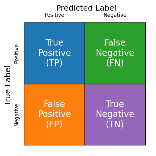
A binary classification model is one that produces two outputs: "Thing we want" (Positive) or "Not the thing we want" (Negative). For example, suppose we have a model that ingests medical information (e.g., an x-ray, MRI, or other image) and identifies cancerous tissue. In this case, the "thing we want" (to identify, the Positive) is cancerous tissue.
True Positives (TP)
True Positives are correctly identified instances of the "thing we want." For example, each case where the model correctly identifies the cancerous tissue is a true positive. In the confusion matrix of Figure 1, this corresponds to the blue region (top left).
False Negatives (FN)
False Negatives are incorrectly labeled instances of positive examples. Each time our cancer-detecting model fails to recognize cancerous tissue is a false negative. In the confusion matrix of Figure 1, this corresponds to the green region (top right).
False Positives (FP)
False Positives are incorrectly labeled instances of negative examples. These are cases where our model is fooled into believing that a negative example is positive. Each time our cancer-detecting model believes benign (normal) tissue is cancerous is a false positive. In the confusion matrix of Figure 1, false positives are shown in the orange region (bottom left).
True Negatives (TN)
True negatives are correctly identified instances of negative examples. Each time our cancer-detecting model detects no cancer and the patient is, in fact, cancer free, it is a true negative.
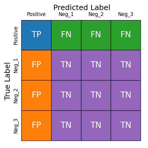
Dealing With Multi-Class Classification
When our model produces more than two outputs, we can still similarly reason about the outputs. To do that, we consider one (or several) of the output classes to be positives and all the remaining classes to be negatives. Figure 2 shows one such example where the model has four outputs and one of the outputs is considered to be the positive case.
Figure 2: An example of a generic confusion matrix for a multi-class model.
Accuracy
Accuracy is among the most common metrics and the easiest to understand conceptually. Put simply, accuracy is the percentage of examples for which the model produces the correct output.
We can also think about how accuracy is derived from the confusion matrix. For a multi-class model that is treated as a multi-class model (not as a binary model where classes have been lumped together), the accuracy is the sum of the diagonal entries divided by the sum of all the entries. For binary models (or multi-class models treated as binary models), the accuracy is:
Caution: Accuracy is an easily deceptive metric—especially when your dataset is imbalanced or when you care more about accuracy in some cases than others. For example, consider your cancer detection model. If everyone was screened, the number of Positive examples (people with cancer) would be small compared to those without cancer (say, 95% of people don't have cancer at any given moment). If the model always predicted that the patient didn't have cancer (regardless of the input image/data), then its accuracy would be 95%. That number sounds (potentially) high (and therefore good), but in reality this model would be useless—in fact, maybe worse than useless.
Precision
Also known as: positive predictive value.
Precision is the probability that the (human-provided) label is X given
that your model output is X.
Said another way: Precision is the probability that you are correct given your current prediction.
Or, if your model predicts cancer, how likely is it that the patient actually has cancer?
Any classification model will have a (usually different) precision for each possible output. The precision (for each class) can be easily determined from the confusion matrix C. For class j the precision is C[j, j] (the number of correct predictions of class j) divided by the sum of all entries in column j (the number of examples for which the model predicted j). When we compute the precision for class j, we consider class j to be the Positive class. It then follows that:
Recall
Also known as: sensitivity, hit rate, or true positive rate.
Recall is the probability that the model will predict X given that the input is labelled X.
Said another way: Recall is the probability that your model will be correct when given examples with
a chosen label.
Or, if the patient has cancer, what is the probability that your model
correctly recognizes it as a cancer?
Any classification model will have a (usually different) recall for each possible input class. The recall (for each class) can be easily determined from the confusion matrix C. For class i, the recall is C[i, i] (the number of correct predictions of class i) divided by the sum of all entries in row i (the number of examples of class i in the dataset). When we compute the recall for class i, we consider class i to be the Positive class. It then follows that:
Disambiguation of precision and recall?
Precision and Recall are often confused and, at first glance, appear to be quite similar when, in fact, they each answer very different questions. When deciding whether you are interested in a model's precision or recall, it may be helpful to determine which of the following cases best fits your need.
-
Case 1:
My model predicted class X.
I want to know how likely it is that my model is right: Precision -
Case 2:
I need to find Xs in my data.
I want to quantify how likely it is that my model will find them: Recall
It is possible for models be ineffective and still have a high precision or recall, and (severe) imbalances in datasets can make this worse. For example, if your model always predicts cancer (regardless of whether the patient has cancer or not), then the recall of your model (on cancer) is 100% (meaning that you correctly identify every instance of cancer in the dataset), and the precision of the model (on cancer) is whatever fraction of the dataset consists of cancerous examples (it could be high if they are abundant or very low if they are rare).
F1 Score
The F1 score is related to both precision and recall; the F1 score is high when both precision and recall are high; the F1 score is low if either precision or recall is low. The F1 score is the harmonic mean of precision and recall. In mathematical terms:
Another way to think of the F1 score is to consider the confusion matrix. The F1 score for category j is 2C[j, j] (twice the number of times a correct prediction was made on category j) divided by the sums of row j and column j.
Average Precision (AP)
Average precision (AP) is the industry standard metric (used by COCO, PASCAL VOC) for benchmarking object detectors. It is defined as the area under the precision-recall curve, computed separately for each label class and IoU threshold.
AP is useful for determining how effective an object detection model is at finding objects and assigning them high confidence scores. AP can be used to determine the optimal IoU threshold.
Since AP integrates over confidence scores, it is not useful in determining an optimal confidence threshold.
Mean Average Precision (mAP)
Mean average precision (mAP) is the AP averaged across all label classes. It is best used to compare models quickly as it provides a general overview of model performance.
ROC Curves and AUC
In this section, we discuss briefly what ROC curves are, how they can be used to optimize a classifier, and how they can be used to quantitatively compare classifiers.
What are ROC curves?
Before we discuss ROC curves and AUC, we need to back up and consider the output
from classification models.
As mentioned in the section above on Loss, classifiers output a score for each class.
That score could be normalized in such a way as to make the values appear to be probabilities
(all scores non-negative and sum to 1), or they may not be normalized.
For our discussion here, it does not matter whether the scores are normalized or not so
long as they are consistent (e.g., the model we are evaluating always outputs normalized or
raw scores).
In our discussion of accuracy, we said that the prediction was whichever class had
the highest score, so an output of cancer: 0.9, benign: 0.1 would be interpreted as prediction
of cancer.
We will now adjust that slightly and suppose that our model is simply a cancer detector,
so our model output will simply be cancer: 0.9.
Note that when the model is only producing a single value, then we cannot know whether
the cancer score is larger than the benign score (since normalization requires more
than one output and the model does not produce a benign score).
Further note that any model can be turned into a 1-class classifier by soley considering
the score of a particular class of interest (our Positive class).
Given this scenario, there are two questions that ROC curves (and AUC) will help us
answer.
First, since we don't have multiple classes to compare (taking the largest score to be
the prediction), we need to know what threshold determines our prediction of cancer.
For example, is cancer: 0.9 a large enough score to predict that this is cancer?
Second, a related question is: How do we quantify the tradeoff made by adjusting those
thresholds or compare the quality of two different 1-class classifiers?
Figure 3: Example distributions of a model's scores (outputs) on positive and negative examples.
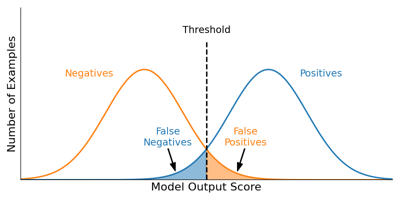
Consider Figure 3. Here, we have computed the model scores for all our negative examples (left, orange distribution, the height of the curve reflecting the relative number of examples) and the model scores for all the positive examples (right, blue distribution). Suppose that we have chosen a threshold t (for the moment it doesn't matter what that is or how it was chosen, we'll discuss that later) so that if a score is at least t, we predict that it is a Positive example—i.e., our model predicts this is cancerous. Otherwise, if the score is lower than t, we predict it to be a Negative example—i.e., our model predicts it is benign. When we evaluate our model (on our validation or testing split), there will be some number of Positive examples in the data (call that number P), and when our model scores those examples with a score larger than t, they are true positives. So, the area under the blue curve and to the right of the threshold line represents the number of true positives (TPs) that our model generates at the given threshold. Likewise, our data will contain some number of Negative examples (call that number N). When our model scores those negative examples with a score larger than t, it produces false positives. The area under the orange curve and to the right of the threshold line represents the number of false positives.
Figure 4: An illustration of the impact of adjusting the thresholds. Low thresholds may have many false positives but few false negatives. Higher thresholds have fewer false positives and more false negatives.
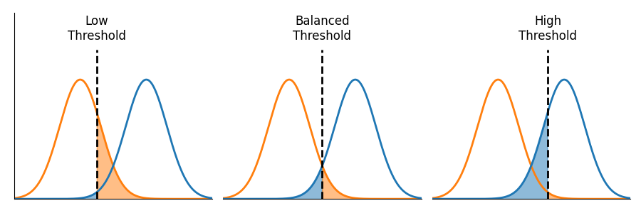
As illustrated in Figure 4, adjusting the threshold does not affect the distribution of a model's outputs. It does, however, affect how those outputs are interpreted. And, importantly, the choice of a threshold is always a tradeoff. Low thresholds will have many false positives but very few false negatives. Higher thresholds have fewer false positives and more false negatives.
Figure 5: An illustration of the impact of varying models. Note that different models produce different distributions of scores. Better models produce distributions that overlap less.
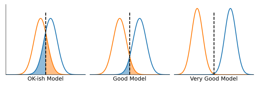
Figure 5 illustrates what can happen as the model changes. Most importantly, different models will produce different distributions of scores. Better models produce distributions that overlap less.
As previously mentioned, the choice of threshold results in a tradeoff for any model. The purpose of ROC curves is to help us quantify and optimize that tradeoff for our application. In order to generate a ROC curve, we need to be able to compute two values for any threshold: the True Positive Rate (TPR) and the False Positive Rate (FPR). The TPR is the fraction of the area under the blue curve (in any of the Figures 3-5) that is also to the right of the threshold—or the number of true positives (TP) divided by the number of positive examples in our data (P).
Similarly, the FPR is the fraction of the area under the orange curve and to the right of the threshold—or the number of false positives (FP) divided by the number of negative examples in our data (N).
The true positive rate is the percentage of positive examples your model correctly predicts; the false positive rate is the percentage of negative examples your model incorrectly predicts. When the prediction threshold t is very low, then the model will make many positive predictions. The result of many positive predictions is that many positive examples will be correctly identified (many TPs, or a high true positive rate) and (potentially) many negative examples will be incorrectly predicted to be positive (many FPs, or a high false positive rate). The opposite happens if the threshold t is very high; in that case, very few positive predictions are made. The true positive rate will be low, and the false negative rate will be low.
A ROC Curve illustrates the tradeoff between the True Positive Rate (TPR) and the False Positive Rate (FPR) as a function of the classification threshold.
Important: A ROC curve should always be generated using the Validation split of a dataset.
Figure 6: Example ROC curves along with the ideal classifier.
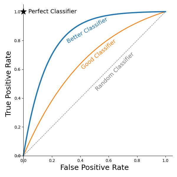
As illustrated in Figure 6, ROC curves always start from (0,0) or a 0 TPR and a 0 FPR. This value is achieved whenever the threshold is set higher than the largest model output value for the validation/testing dataset. ROC curves may have many different shapes, but they never decrease (moving from left to right). This is because reducing a threshold never reduces the TPR or the FPR; the rates may remain the same, but they never shrink when a threshold shrinks. As the threshold is continually reduced, the threshold is eventually lower than the lowest model output on the validation/testing dataset. With thresholds that low, the model is always predicting Positive. The result is a 100% TPR and a 100% FNR; therefore, the ROC curve intersects (1,1). As indicated in Figure 6, the ideal point for a model is to be at (0, 1)—100% TPR and 0% FPR. But, such models rarely (read: never) occur in practice with real data. Instead, there is always a trade-off.
How to choose a threshold
There are (at least) as many ways to choose the ideal threshold as there are data scientists and their managers. In this section, we discuss a few of the more reasonable (or at least more common) ways of making the selection. As noted before, ROC curves are made from validation splits of data. The primary purpose of a validation split is to assist in the model selection process. Choosing a threshold is (essentially) choosing a model.
Avoid the temptation to evaluate your model on the testing data with multiple different thresholds. If the model statistics you see when evaluating the testing data influence which model (or threshold) you want to use in the future, then that split has now become an additional validation split, and your ability to accurately/confidently estimate future performance is hindered.
In the remainder of this section, we describe a few methods to choose a threshold along with scenarios where each method may make sense. Ultimately, it is up to the data scientist (DS) working together with a domain expert (assuming the DS isn't also a domain expert) to use their judgment to determine what is best and why. In order to know which is best, you need to understand what is important to your situation. Which is more important: correctly identifying the positive examples (increasing true positives) or reducing (minimizing) the number of false positives? The importance of either will depend strongly on the application.
Scenario 1: Your model is designed to detect cancer. False negatives are bad—someone has cancer, but your model says they are fine. You therefore decide that your True Positive Rate (percentage of cancer cases detected) must be very high, say 99.9% (or, it only misses one in 1,000 cases).
Example 1: Choose the maximum possible threshold that guarantees the minimum acceptable True Positive Rate. Thinking back to Figure 3, we push the threshold as far to the left as needed so that the false negative region is small enough (compared to the overall size of the positives), but we move it no further left than needed to avoid unnecessary false positives.
Note: Even when the threshold is chosen to meet a minimum acceptable TPR, it does not mean that your model (with threshold chosen thusly) is necessarily fit for deployment. Part of the evaluation of your model will be to see if setting the threshold in this manner (guaranteeing detection of almost all cancer) results in too many false positives. For example, if the price of detecting (almost) all cancer cases is that 50% of all patients who don't have cancer are told they do, then this model may not be sufficiently good to be used in practice. Determining a maximum acceptable False Positive Rate is a judgement that the DS must make in conjunction with domain experts, stakeholders, etc.
Scenario 2: Your model is designed to detect and remove spam/phishing emails. While it is nice if your model correctly identifies (and removes) more spam, if your model incorrectly identifies good (legitimate) emails as spam and removes them, that is a problem. In this case, your primary concern is confusing legitimate email for spam. The Negative examples are the legitimate emails, so you want to minimize the number of false positives (or the false positive rate). It may be the case that we expect 99.9% of our legitimate emails to not be identified as spam.
Example 2: Choose the minimum possible threshold that guarantees a maximum acceptable False Positive Rate. Thinking back to Figure 3, this corresponds to pushing the threshold to the right far enough that the false positives are sufficiently small but not further than needed. Far enough guarantees that legitimate email gets through. "Not further" means that we identify as much spam as possible (given the constraints of not misclassifying too many legitimate emails).
Example 3: Choose a threshold that maximizes some other metric. For example, you may want to maximize Accuracy, Precision, Recall, or F1-score, etc.
Example 4: Choose a threshold that minimizes the distance to the perfect classifier.
Scenario: Both of these approaches might be used when you are either unsure how to value the tradeoff between TPR and FPR. You are offered an additional 10% TPR for the cost of an additional 10% FPR, and you don't know which model you'd rather have—or there's no compelling reason why either would be better. Keep in mind that these approaches may not yield a uniquely best threshold (e.g., there may be multiple points on the ROC curve that are equidistant from the Perfect Classifier point). And, keep in mind that there are many different distance metrics (and the choice of distance metric will impact which point on the curve is closest).
Example 5: Choose a threshold at the "knee" of the plot. Note: Some ROC curves are not as nicely behaved as those pictured in Figure 6, so it may not be clear where (or if) a ROC curve has a knee.
Scenario/Reasoning: One way to define a knee is a point on the ROC curve where the derivative is 1. Note that being an increasing function doesn't guarantee that the ROC curve is differentiable. And, since we cannot guarantee that a ROC curve is differentiable, we cannot guarantee that there is a point where the derivative is 1. But, with those caveats in mind, the rationale here is that (as illustrated in Figure 1) when thresholds are very high (close to (0, 0) location), small reductions in the threshold have a disproportionate impact on the TPR—or, said another way, the TPR is increasing faster than the FPR. In these areas, the derivative is larger than 1, implying that by adjusting the threshold we can improve the TPR by more than 1% while the cost is an increase in the FPR of less than 1%. When the derivative is 1, the reward and cost are equal; or, we improve the TPR by 1% for the cost of a 1% increase in the FPR. But, after we cross that threshold, the FPR increases faster than the TRP, and we are no longer willing to pay that price; i.e., we are unwilling to increase the TPR by 1% for the cost of an increase to the FPR by more than 1%.
How to quantitatively compare classifiers
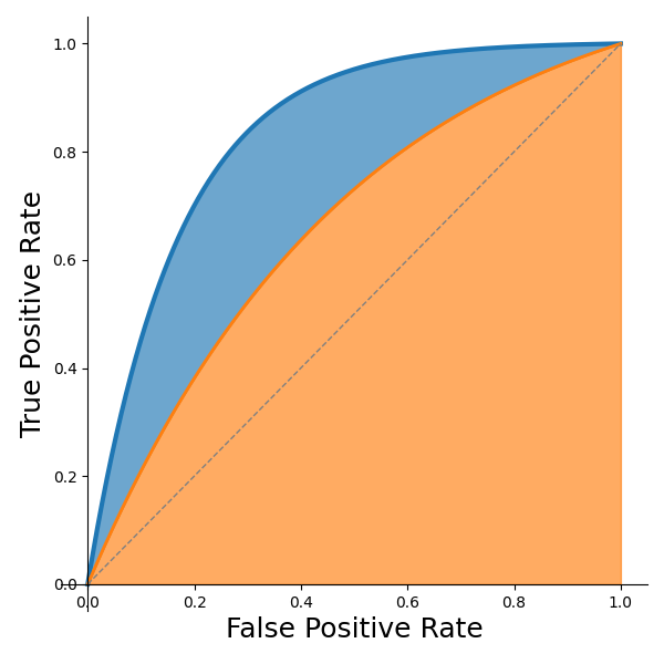
Since ROC curves capture an entire landscape of tradeoff possibilities, when we need to compare two ROC curves, we usually want to compare metrics that consider the entire curve (not just a single point along the curve). For that reason, a common metric for quantitatively comparing two ROC curves is the Area Under the Curve (AUC). The area in orange of Figure 7 represents the AUC of the orange curve. The area in the blue slice represents the amount of improvement of the blue curve over the orange (both curves' AUC includes the orange region). Note that the AUC of the random classifier (dashed line) is 0.5, and that typically serves as the (lower-bound) baseline of comparison; the perfect classifier would have an AUC of 1.0.
Figure 7: Area under the curve illustration.
Note: While AUC does serve well to compare two ROC curves, it is not used to choose a threshold, and it does not convey (directly) the accuracy of your model (e.g., the AUC being 0.9 does not mean that the model achieves 90% accuracy)—nor can one necessarily derive an approximate accuracy from the AUC.
Wikipedia's entry on ROC Curves is a good source for additional information.
IOU
The Intersection Over Union (IOU) metric is frequently used for image segmentation or object detection. It measures how precisely a predicted bounding box (or mask in the case of segmentation) overlaps the corresponding annotation (target). Figure 8 gives an example of the various regions of interest required to compute this metric. In this case, the target (blue) is the bounding box of an object provided by annotation. The prediction (red) is the bounding box output by the model. And, the intersection (purple) is the region where the target and prediction overlap.
Figure 8: Illustration of elements used for calculation of IOU.

Ideally, the prediction would exactly match the target, in which case the intersection would be the same as the target and prediction. The IOU is computed by measuring the area of the intersection (e.g., the number of pixels that are in both the target and prediction) and dividing that area by the area of the union of the target and prediction region (e.g., the number of pixels either in the target or prediction).
Note: IOU always lies between 0 (implying no overlap, bad) and 1 (implying perfect agreement, good). While larger numbers are better, it may likely take a reasonable amount of experience before one develops good intuition about how large this number should be before the model is good. For example, in Figure 8, the intersection feels like it is reasonably sized even though the size of the intersection is a little less than half the size of the target. The intersection's size is 4 units; the size of either target or prediction is 9 units, with the union of the two being 14 units. Hence, the IOU in that example is 4/14=0.2857.